SHORTHAND BASICS
A short & sweet intro to the editor
A simply powerful editor
The basics of the Shorthand story editor are very simple to learn. Follow along with this story, edit parts of it, and you'll be on your way to making your own story in no time.
Knowing your way around
The editor is composed of three major components: the main editing window, a vertical bar on the left showing 'thumbnail'-sized versions of the 'sections' that comprise the story, and a strip across the top which is used primarily to publish the story and control 'meta-data' like the story's visual theme, sharing options, and who in your team can work with you on the story.
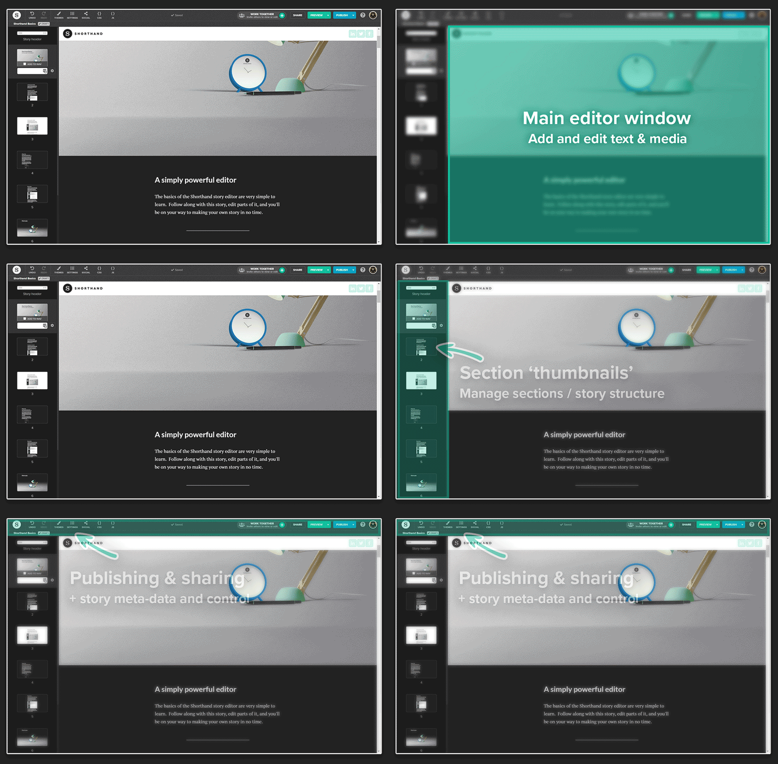
That vertical thumbnail bar on the left highlights the section of the story that is predominantly in the main window - likely the section that you are actively editing (it also enables adding, deleting, and rearranging sections, but we'll get to that later).
The Text section, used here, is the simplest of all the Shorthand 'section types'. By default, it is a single column of text, though can also be modified to contain images, multimedia elements, tables of data, and multiple columns.
The simplest edit:
CHANGING TEXT
To edit the text in this story, while in the editor, click on any block of text and type over it. Try it in the title above. Your experience should look a little like this:
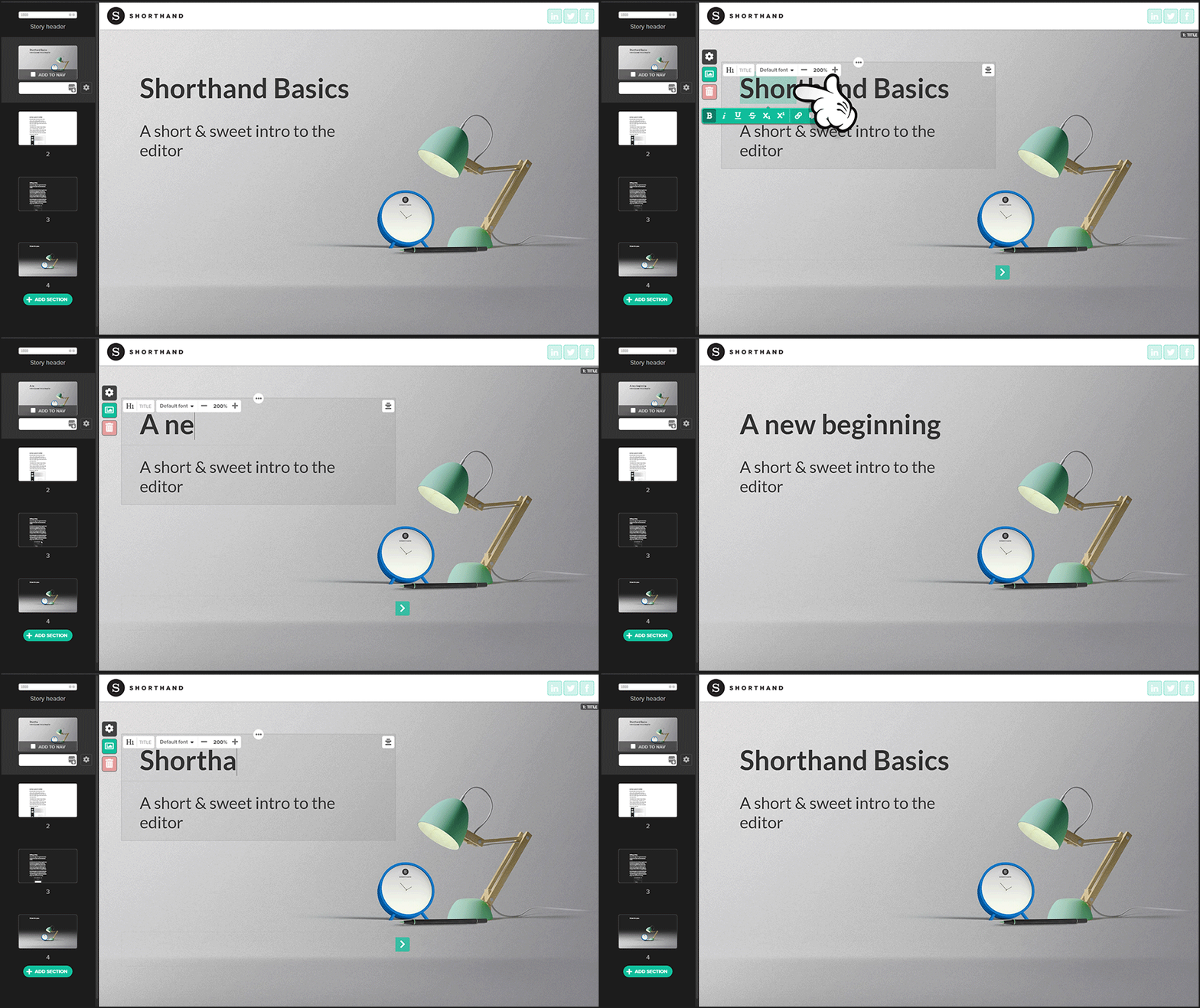
Highlight some of the text and you'll see a toolbar that enables setting various styles.

"Block styles" affect all of the text within a block, and can control the text type (heading or paragraph text), font, size, and alignment.
"Letter" or "word" styles affect the individual highlighted parts of text that are within a block. This enables making some (or all) of the text in a block bold, italics, contain a link, be a different colour, and more.
Highlight some text in the title section, or this column, and click a button to change its style.
In the Title section, text blocks can also be moved across the screen with the green arrow buttons that appear on either side of the block. Here in the Text section, the whole column can be moved left or right:

Try moving this column by clicking one of the green arrows.
Green buttons are used for most primary actions in Shorthand. If you want to change something, look for a nearby green button.
Aside from text, images are the most commonly added element of a Shorthand story, so we'll take a look at them next.
Images & video:
MEDIA
Within Shorthand, images and video are collectively called "media", and different section types support using media in different ways.
Below is some foreground media: a single image. Mouse over the image and you'll see some new control buttons to change its size and alignment within the column (if the image is narrower than the column), and a red trash-can icon to delete the image.
Let's delete it!
Mouse over the image below and click the red icon in its top-right corner.
Now bring it back.
In the top-left of the editor, next to the Shorthand logo, there's both an 'UNDO' and a 'REDO' button. Click 'UNDO', and the image you deleted will return. Undo and redo buttons will work with most actions in Shorthand, so don't worry about making mistakes: you can always undo them.
Change an image
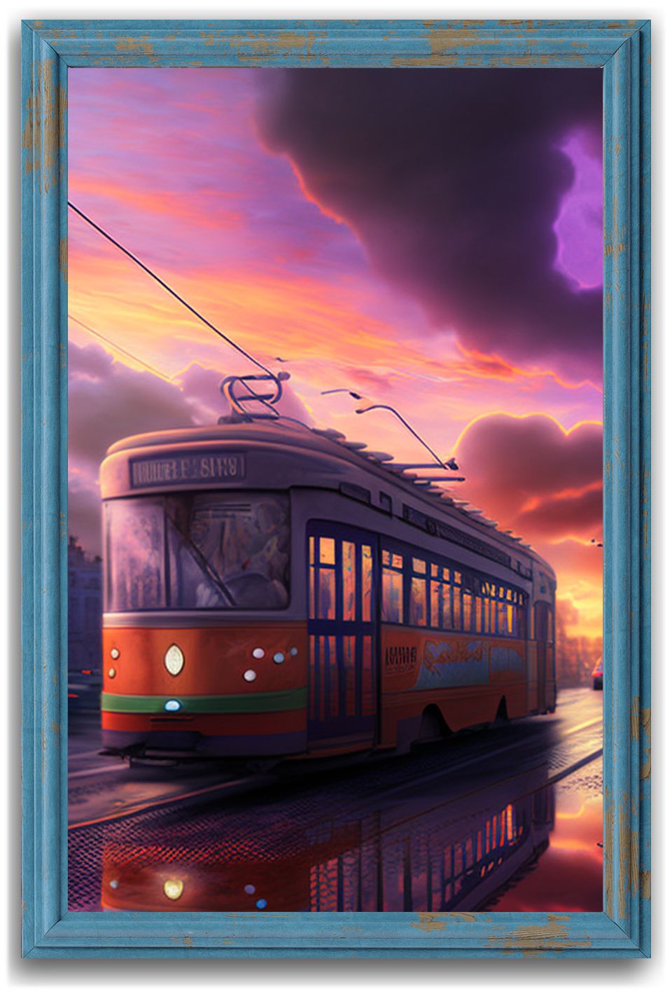
When you mouse over the image above and click the green EDIT MEDIA button in its top-left corner, a new window will appear, with an image in each of two columns:
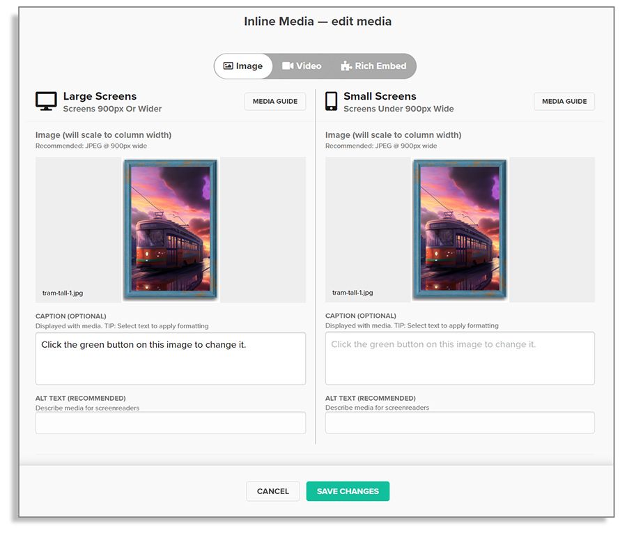
The column on the left shows the image that will be seen by readers of your story using a big or wide screen (such as on a laptop or desktop computer), while the right column shows the image that will appear for readers using narrow or small screens (such as a phone). In this case, those images are the same.
You might want to use a tall image for phones so that small details aren't lost, or to better fill the tall and narrow screen. By default the same image is used for both. It's up to you to choose whether to use the same or different images.
After opening the panel, mouse over the image in the left column, and click the green button that appears. Your file system will open so that you can select an image from your computer. If you wish, you can add a caption and/or 'alt text' (for search engines and screen readers) to describe the image, then hit the green "SAVE CHANGES" button at the bottom of the panel to see your new image in place.
This is what the experience will look like:
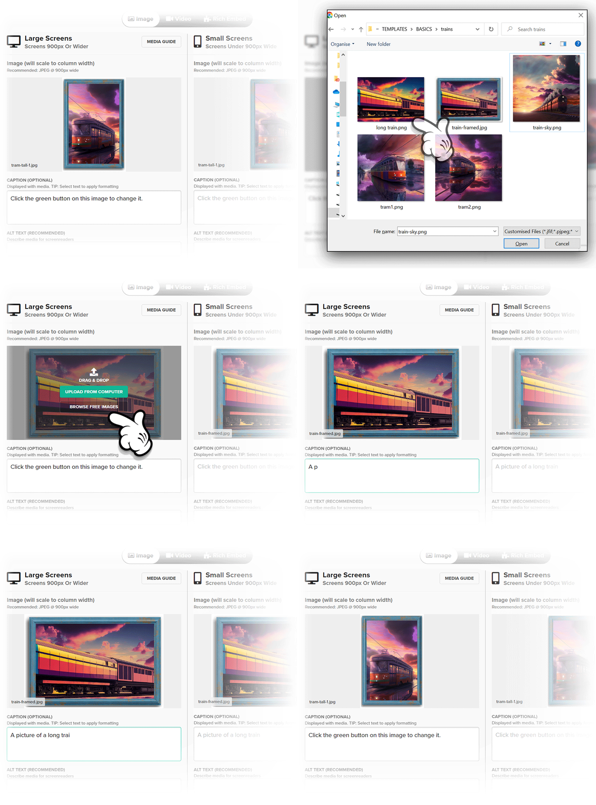
Scroll back up and change the picture of the tram to a picture from your own computer.
Add new media to the section
You may have already noticed when interacting with the text in this column: as you mouse-over a block of text here, a row of small buttons appears at the top or bottom of the block. Those buttons allow for adding a new item in that position. Along with lines, buttons, tables, and quotes, there's a button to add images and other types of media.
Click the first button in the row at the top of this block of text to add a new image.
Other types of media
If you explore the media panel a little more, you'll see that you can also 'drag & drop' images from your computer into the panel, or search for and include free images from the photo library Unsplash.
Now you know how to change media in any section. You could scroll back to the very top of this story and change the background image behind the title. The process is the same: look for the green EDIT MEDIA button in the top left of an existing image, and click it to open the media panel.
Media panels also include a toggle at the top, from which your can choose to add video instead of an image. Depending on the section type, there may be other media options, too.

If you choose one of the non-image options, the panel will change to show some new default media and some instructions on what's required to include your own.
Mix & match:
ADDING VARIETY
Many section types have options that enable section-wide changes to the style of elements within the section.
In a text section such as this, options include changing the dominant text colour and background colour, or applying effects such as fading text as your readers scroll. Other section types have options that set section height, coloured overlays, animations and transitions between changing images.
To see what options are available within a section, click the SECTION OPTIONS "cog" icon that appears in the top-left of the section in the main editor window, or next to the thumbnail image of the section.
Change the colour of this section
Click the cog icon at the top left of this section or next to its thumbnail image, and choose a different colour scheme. The experience will look like this:
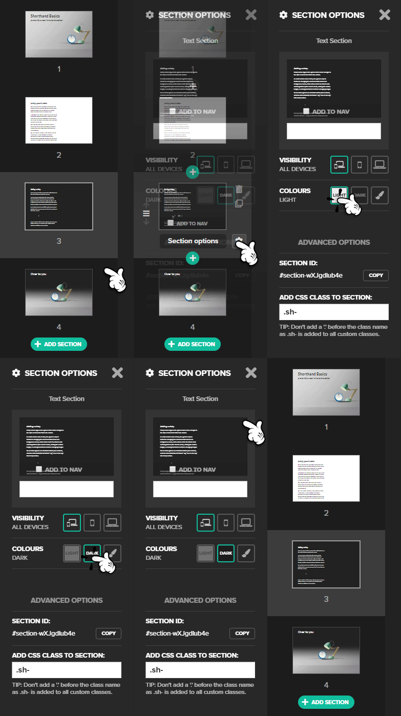
You'll find two default colour-theme presets: Light and Dark. These presets will change both the colour of the background in the section and the dominant colour of all the text in the section. If you'd like a different scheme, instead of clicking the Light or Dark buttons, click the paintbrush icon and choose other colours to suit.
Everybody's shuffling:
MANAGING SECTIONS
Now that we are looking at the thumbnail bar on the left, it's a good time to discuss its powers.
Along with section options, each thumbnail image shows a range of buttons when moused-over:
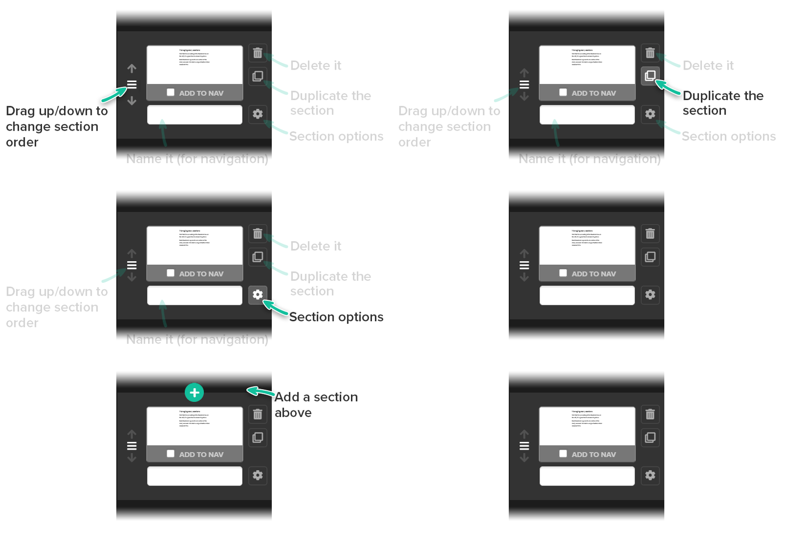
Adding new sections to the story is as simple as clicking the green + icon above or below the section thumbnail (you can duplicate one of the existing sections too, which is a fast way to reuse all the styles you've applied already). When you do click the + button, a new panel will open, showing a range of 'section types' to choose from, each with their own blend of media and options, ready for you to edit just as you've done in this story. No matter the section type, the basics of how to edit it remain the same.
Add a new section
Click one of the green + buttons on the left to see the range of pre-made sections available, then add a new one to the story and see what edits you can make.
When you are done and wish to return to the dashboard to manage your team, your stories, or to create new ones, click the Shorthand logo at the top left.
Over to you
